Workflow Automation
Visual node-based workflow editor with 30+ step types. Build complex automation flows with conditional branching, variables, sub-workflows, and step-by-step debugging.
Overview
Visual Editor
Drag-and-drop node canvas with auto-layout, minimap, and snap-to-grid.
30+ Step Types
Tap, swipe, element actions, app control, key events, variables, branching, and more.
Step-by-Step Debug
Pause, resume, and step through workflows one node at a time.
Session Integration
Start and end Gaze sessions within workflows for automated test reporting.
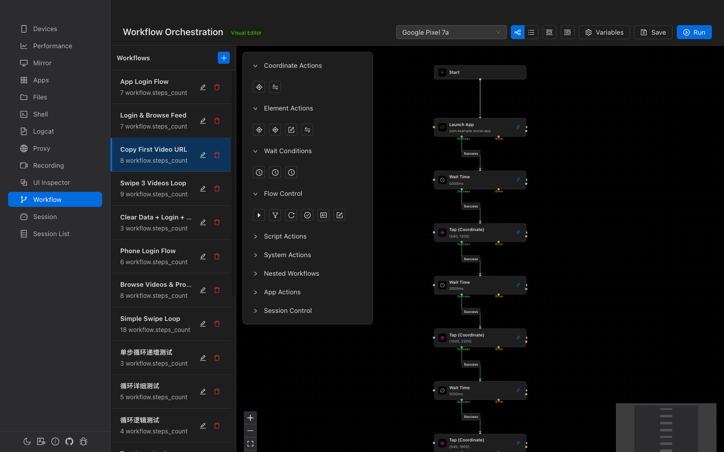
Workflow List
The left sidebar (250px) shows all saved workflows:
- Click to select and load into the editor
- Double-click the name to rename inline
- Delete button with confirmation
- + button to create a new workflow (auto-creates a Start node)
- Running workflows show a spinning indicator
Visual Node Editor
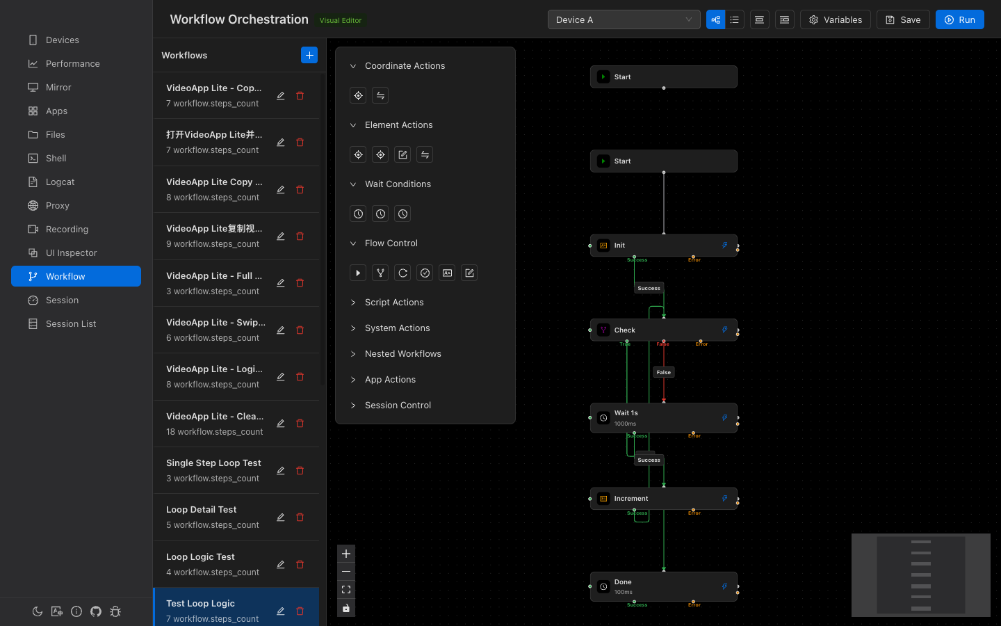
The main canvas area uses React Flow for a node-graph editing experience:
- Dot-grid background with snap-to-grid (15px)
- Minimap in the bottom-right corner
- Zoom controls — Zoom in/out/fit
- Auto-layout — Vertical (top-to-bottom) or Horizontal (left-to-right) using dagre algorithm
Node Appearance
Each node is a 280px-wide card showing:
- Step type icon and name
- Type-specific summary (e.g., coordinates, selector, package name)
- Lightning bolt button for single-step execution
- During execution: primary-color glow effect on the active node
Connections
Nodes are connected via color-coded edges:
- Success — Green arrow for normal flow
- Error — Orange/red arrow for error handling
- Branch nodes have: True, False, and Error outputs
Node Deletion
Delete nodes with Backspace or Delete. The Start node cannot be deleted. When a node is deleted, incoming edges are automatically reconnected to outgoing targets to preserve the flow.
Step Types (30+)
Steps are organized into 9 categories in the tool panel:
Coordinate Actions
| Step | Description |
|---|---|
tap | Tap at specific screen coordinates (x, y) |
swipe | Swipe between two coordinates with duration |
Element Actions
| Step | Description |
|---|---|
click_element | Click a UI element found by selector |
long_click_element | Long-press a UI element |
input_text | Type text into a UI element |
swipe_element | Swipe from a UI element in a direction |
Wait & Assert
| Step | Description |
|---|---|
wait_element | Wait for a UI element to appear |
wait_gone | Wait for a UI element to disappear |
wait | Wait a fixed duration (milliseconds) |
assert_element | Assert a UI element matches expectations |
scroll_to | Scroll until an element is found |
Flow Control
| Step | Description |
|---|---|
branch | Conditional branching (True/False/Error outputs) |
set_variable | Set a workflow variable (supports arithmetic) |
read_to_variable | Read a UI element's attribute into a variable |
run_workflow | Execute another workflow as a sub-workflow |
App Actions
| Step | Description |
|---|---|
launch_app | Launch an app by package name |
stop_app | Force-stop an app |
clear_app | Clear app data and cache |
open_settings | Open app's system settings page |
Key Events & Screen
key_back, key_home, key_recent, key_power, key_volume_up, key_volume_down, screen_on, screen_off
Script & ADB
| Step | Description |
|---|---|
script | Run a named automation script |
adb | Execute a raw ADB command |
Session Control
| Step | Description |
|---|---|
start_session | Start a Gaze session with configurable logcat, recording, proxy, and monitor |
end_session | End the current session with a status (completed / error / cancelled) |
Step Configuration
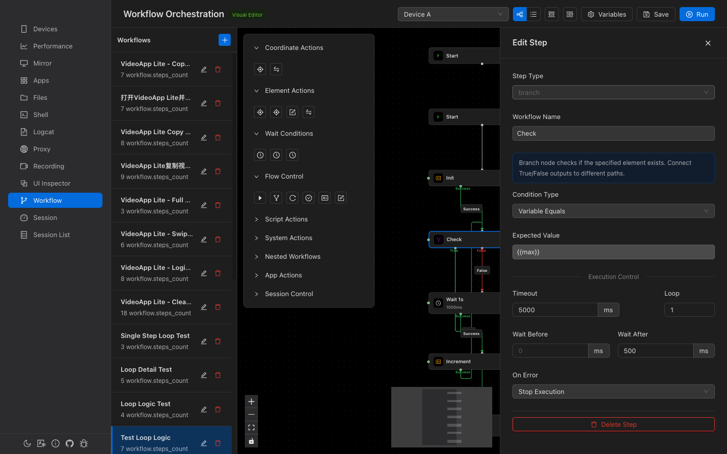
Click a node to open the 450px edit drawer on the right. All changes are auto-saved.
Common Fields (All Steps)
| Field | Description |
|---|---|
| Name | Optional label for the step |
| Timeout | Maximum execution time (ms, default: 5000) |
| Loop | Repeat count (default: 1) |
| Pre Wait | Delay before execution (ms) |
| Post Delay | Delay after execution (ms) |
| On Error | Stop or Continue |
Element Selector
Element-based steps use selectors to find UI elements:
- Text — Match by visible text
- Resource ID — Match by
resource-idattribute - Content Desc — Match by accessibility description
- Class — Match by Java class name
- XPath — XPath expression for complex matching
- Bounds — Direct bounding rectangle
An Element Picker button (crosshair icon) opens a modal to select elements directly from the device screen.
Conditional Branching
The branch step evaluates a condition and follows the True or False path:
| Condition | Description |
|---|---|
exists | Check if a UI element matching the selector exists |
not_exists | Check if a UI element does NOT exist |
text_equals | Check if element text exactly matches expected value |
text_contains | Check if element text contains expected substring |
variable_equals | Check if a workflow variable equals expected value |
Variables
Workflows support key-value variables that can be set, read, and used in step configurations.
- Define variables — Click the "Variables" button (gear icon) in the toolbar to open the editor
- Use in steps — Reference variables with
{{variableName}}syntax (autocomplete available) - set_variable — Set a variable to a value (supports arithmetic:
{{count}} + 1) - read_to_variable — Read a UI element's text/id/class into a variable
- Runtime display — During execution, all variable values are shown in the runtime context panel
Execution & Debugging
| Button | Description |
|---|---|
| Run | Save and execute the workflow on the selected device |
| Pause | Pause execution between steps |
| Resume | Continue from the paused position |
| Step Next | Execute only the next step, then re-pause |
| Stop | Force-stop the workflow |
Runtime Context Panel
While a workflow is running, a floating panel shows:
- Workflow name and paused state
- Progress bar with percentage
- Current step name and type
- Live variable values
Single Step Execution
Click the lightning bolt button on any node (except Start) to execute just that one step independently — useful for testing individual actions.
List View
Toggle between Canvas (visual) and List view using the button group in the toolbar. The list view shows steps in linear execution order with drag-and-drop reordering.